
This photograph was taken earlier this year.
I really like the strong contrast between black and white,its simply beautiful.

 This is two prints I done for a album cover project titled, "Pre- flight Safety Instructions".


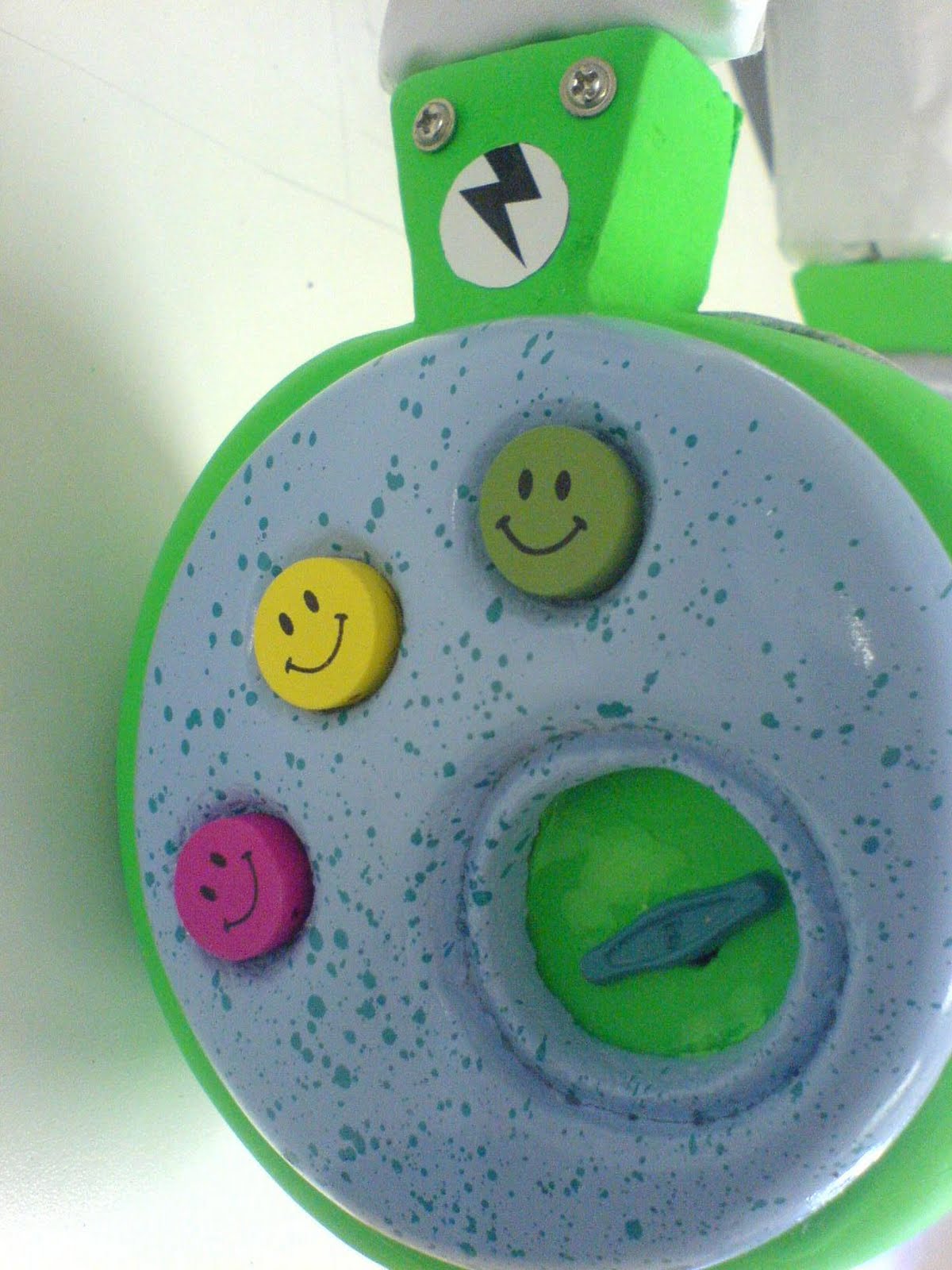
 This was another project completed during my 1st year at CPUT. As our final project we had to produce a package that celebrated 'Converse Shoes'. I had selected the year 1978-1988 , thus the concept had stemmed from the band 'Blondie' and their musical success during the 70s and 80s. Since neon bright colours were popular during this period, I decided to incorporate these colours into my design. The concept of the tag was to reference the popularity of the cassette as a medium of listening to music.


